#gradient maps are also AWESOME
Explore tagged Tumblr posts
Visit Tumblr Blog
Explore Tumblr blogs with no restrictions, modern design and the best experience.
Last Seen Tumblr Blogs


Fun Fact
12.7% of mobile users access Tumblr.
Text


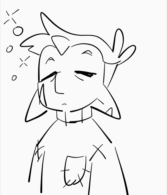
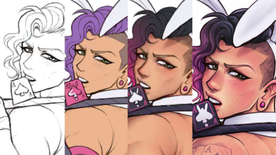
i might burn out but idc cuz hollow knight!
#the hollow knight#hollow knight#thk#thk fanart#hollow knight fanart#art#bug game or smth#i did this in 30 minutes#gradient maps are also AWESOME#my new fav thing
221 notes
·
View notes
Note
Sixteenth Day Event Prompt:
George sees Dream through a thick fog
The whole world used to be theirs, now only a shed of memories remains.
(The scene that Popped into my head from the prompt is like. One of those dramatic confrontations. Accusations, tears, yelling, a heartbreaking last word from Dream. George left standing there, Dream’s old broken mask in hand. The two of them know this won’t ever leave the fog)
My lil thing for the @sixteenth-day-event 💕 just a tinyyyyyy bit late
#sixteenthdayevent#georgenotfound fanart#mushroom george#dream smp#dreamnotfound#YEAH I GOT DNF FOR PROMPT ITS AWESOME#I should not had procrastinated and be faced with Moving Day lmao#this has major 2021 rabbit vibes lmao#major shout out to procreate gradient map you carry this thank you for existing#also to elmhat for putting everything together this is fun!!#my art
63 notes
·
View notes
Text

How I Made the Colors in Hunger's Bite So Good
first of all: buy my book. buy it and look at the colors. (if you cannot buy the book, ask for it at your local library or i GUESS you can look at these spreads i posted)
we're gonna talk about colors, but more specifically we're going to talk about overlays. if you're an artist you are probably familiar with overlays. we love our overlays. we love to color a picture and then at the very last minute go 'hm. looks bad. i'm going to put a yellowish overlay on it to make it look less bad :)'
do not do this.
i mean you can, and it'll work sometimes, but all you're really doing is tricking your brain into thinking different is better. you've been staring at the image for potentially several hours. none of the choices you made at the beginning mean anything to you anymore. you're just finishing what you started. one of the big reasons you might look at your art and go 'man, this doesn't look that good' is because You drew it and are intimately familiar with it. you know all the flaws and mistakes because You made them and You know what your vision was. one of the great frustrations with art is that the piece in your head doesn't look like something you actually made. you want it to look like somebody else did it, so you can enjoy it as a viewer, not as the creator.
so when you put that overlay on, and suddenly the image looks very different, your brain will go 'this doesn't look like the thing i've been staring at for 2-3 hours! this is different! now it's good!'
and again, sometimes it Is good. but do you actually understand why it's good? or is it just different?
okay so what am i supposed to do smart guy
i'm glad you asked. the trick to making overlays work is to have them on from the start. this requires knowing what mood you want to convey in your scene from the very beginning. hopefully you know what mood you want to convey. you do, right? and i don't just mean happy or sad, i also mean safe, threatened, familiar, strange, soft and harsh. blue is not always sad. green is not always healthy. yellow/orange are not the only way to convey a companionable warmth.
okay did you pick the mood? do you have an idea of what color you want to use to represent that mood? great. i'm gonna use blue to convey the cool, clean white of a ship's maintenance corridor without making things literally white. and i'm going to stick in two characters whose color palettes consist of bright yellow, brown, and wine red. awesome. i definitely know how those colors would behave under blue lighting.
(here's the thing: no i don't.) this is where a gradient map correction layer comes in. i want my page to be Blue. alright. let's make a gradient map that's Blue.

a gradient map is basically just A Gradient with specific colors connected to specific values. you have your darkest values on the left, and your lighter values on the right. at 100% opacity, this gradient map layer will read the value of anything below it and go 'okay this bit is this dark, so it should be This shade of blue. and this bit is this light, so it should be This shade of blue'.

kind of like a hue or color layer except determined by a gradient rather than one color, so it could also go 'this is light, so it's green' and 'this is dark, so it's purple'. it's math. i don't really get it either. but anyway this is probably not what you want if you want your characters' palettes to be recognizable. emery's sweater is supposed to be a wine red! neeta's skin should be brown, and her shirt should be yellow. these are their Key Colors. generally, i want them to be recognizable. so let's lower that opacity down.

nice! you can definitely now see that emery's sweater is red and neeta's shirt is yellow. and everything is relatively balanced. nothing is too saturated, nothing is significantly brighter than anything else. it's all got a little bit of blue in it. but i've skipped the step of actually picking your colors. because here's the thing with gradient maps.

they hate you and want to fight. when working with gradient maps you must imagine there is a monkey sitting on your shoulder dumping paint in every time you pick a color. the monkey has a tube of blue and he is going to put that blue into everything you paint, but it's not normal paint. it doesn't mix, it overtakes. it won't turn something yellow into green, it will turn it blue. it wants everything to be blue. if you want something to look like the color it's supposed to be, you will have to make it extremely saturated under the layer to essentially fight the paint monkey's blue. hence, emery's sweater is a BRIGHT red, so it will look a little more purpley under the blue. and neeta's skin is very orange, so it can be dulled down into a soft brown.
this is the sort of thing you will have to learn by feel, because it will be different with every gradient map, especially if you start getting into weird ones that aren't monochromatic. you want to know one of my favorite maps to use?

i have memorized where on the value scale all of these colors appear. i can color something using only shades of gray when i have this filter on. i am evolved. if you want to use gradient maps effectively, you'll have to get a lot of practice.
anyway this post got really long and i'm about to go to a movie so i'll talk about how to use screen/multiply/overlay layers later. but gradient maps are the main tool i used to make hunger's bite's palettes so unified across scenes. but you can see way above how they work to turn insane saturated colors into the nice harmonies--and the trick is that i'll never see those saturated colors while i'm working. because i have accepted the paint pouring monkey into my heart, and i trust him. except when i'm coloring wick's coat. holy mother of god every gradient map hated that man's purple coat.
810 notes
·
View notes
Note
this a gorgeous gifset for wicked 💗
https://www.tumblr.com/tidescaller/781106467228073984/glinda-in-wicked-part-i-happy-birthday?source=share
I would appreciate a tutorial for the first gif blending and colouring

Hi anon! thank youuu, i'll leave the tutorial under the cut ૮(˶˃ᆺ˂˶)
As always, basic knowledge on making gifs is required to do this type of edits. I linked some useful guides on my previous tutorial here.
PART I: BLENDING
STEP 1, BASE GIF
I recommend getting ready the gifs you're going to use before any try on blending them. And which ones are right to blend? That's just depends on the scenes you're working on. On this gifset, I made two previous blends that didn't make it to the final version cause I didn't like how it turned out. It's all about trial and error.
For this specific blending, as I'm working with only 2 gifs, I'll start editing first the base and then the one "blended". Adjust your BASE GIF in your canvas as you want.

I sized mine like this cause I imagined the second scene of Glinda behind this one.
STEP 2: BACKGROUND
i followed becca's coloring tutorial for this part, except I didn't add any adjustments yet. only coloring the background for a later gradient blending.

STEP 3: BLENDING
Duplicate your other gif into the canvas and change its blending to screen

Now add a layer mask (the button marked with red in the picture) and, with a soft brush at 200px/300px, start erasing whatever you don't want. Remember black is 0% opacity and white is 100%.


STEP 4: THE BLENDED GIF
The problem I noticed by this point is that my background coloring on the BASE GIF was kinda irrelevant cause now the BLENDED GIF completely covered it (。•́︿•̀。) and I also wanted this one to be pink. In order to do this, I created a gradient map layer and made it as a clipping mask so it wouldn't affect my main gif.


PART II: COLORING
STEP 5: BASE
For the base coloring, I always follow this tutorial cause it's literally how I learned how to do it. Honestly, check all maziekeen's tutorials (she made A TON) cause they are so good and your learn a lot. However, I tend to give my personal touches like adding another vibrance layer if i feel like it, cause I like the colors to pop; or skipping steps if I don't think they fit my gif/style. Anyways, this is the result for now:

and these are my settings


i tried to translate as much as possible (,,>﹏<,,)
STEP 6: SMALL TOUCHES
Could leave the gif as it is, but when I was working on it, I felt like something was missing. So the last step is to apply/paint some small touches of pink (or whichever color you're working on). This trick I learned it from this beautiful and very detailed tutorial from dani (she is awesome!! and her tutorials and gifs are flawless!!)
Create a new layer, use the soft brush tool at 1000px, zoom out your gif and start painting out of the canvas (you can totally paint inside if you feel like it) Play with different opacities and blending modes of the layer, this is literally how I created all these gifs. I know it sounds stupid ajskjas but it's true!! Try what best fits the structure of the gif. The first one I made is with multiply at 60% and you can see how much the gif changed already.

The second being color at 100% and the third one hard light at 30%
STEP 7: THE CHERRY ON TOP
Finally I added an animated overlay from this post. Changed the blend mode to screen and erased a bit of it on glinda's face creating a layer mask and with a soft brush. Added my texts... and that's a wrap! :D

I used the same process on gifs 3 and 5 ⸜(��˃ ᵕ ˂ )⸝♡
#*tutorial#gif tutorial#photoshop tutorial#blending#coloring#allresources#completeresources#dreamcreations#dailyresources#gifmakerresource
34 notes
·
View notes
Text
Hii!!! YTTD fanart from my inprogress playthrough with @rookeryyy!!!
We took a 15-20 minute break from playing and 7 hours later this image was sitting on my screen fully formed. also rook drew sara's warrior cats purrsona!!!
Extra images and thoughts under the cut!!!
Time Spent: 7 hours 24 minutes


Okay so first thing, if it's not obvious, this is them playing warrior cats on the playground!! We have decided they do this. Shadow the hedgehog and baby baby shadow are part of the awesome sillyness that happens when you make a drawing on vc!! Though baby baby shadow himself is a longer running joke between us.
Second thing, this playthrough is SUPER FUN !!!!! Chat and I split the voices evenly (somehow) and we've been adding on silly little bits as we play!!! Like Sara sleeping through the instructions of the gun game (and yet winning flawlessly) and Joe having unwaivering confidence in her.

Also Sara threatening to beat people up, as we see above <33
Though it DOES mean the game takes much longer to get through, especially if you're taking a SEVEN HOUR BREAK to draw FBDJHSBFH
the drawing was INTENDED to be a quick doodle but. as you can see. its gone past that


I had a good amount of struggle with Sara's fist, as I originally had her body turned away from the camera to look mainly at Joeheart, BUT it wasnt working, and I think it looks much better this way anyhow <33
The drawing was first sketched, then colored in grayscale, colors were put on by overlay layer, and after that I did a whole lotta paintover!! <3 As shown below

After I did the greyscale I actually had to use a gradient map to make the darks darker, cause I have a tendency to pick really light colors. All is well though!!
We decided that Sara would be leader of the warrior cats group on the playground, hence being Sarastar, and Joe would be a dog! She takes being a leader very seriously, including hiding snacks around the playground for her clan to hunt! I think I even smell a doritos bag by that bush over there...!!
It's not as obvious in my image as in Rook's, but we also decided that Sara identifies as a gun (because me saying "as a gunslinger" was misheard to be "as a gun"), and Joe is a furry.
im soo happy with this <3 theres so much to LOOK AT Im not used to large canvases <33
#babys first yttd fanart... I guess????#your turn to die#yttd#sara chidouin#joe tazuna#kai satou#shadow the hedgehog#baby baby shadow#what a cast we have here!!!! hehe#my art#finished art
64 notes
·
View notes
Note
Oh hey you use medibang? That's awesome! I miss using it, had to buy clip studio since it refused to work on my pc after my laptop died
Amazing art, I adore how skrunkly you draw everyone!
I used to use Photoshop before I realized/got fed up with just how insanely abusive their subscription service is. I used MediBang before it and I now use MediBang after it! (The blending brushes on Photoshop were so nice but I never should have left.) It sucks your computer didn't want to run it anymore :( But any one-time purchase of software sounds like a good deal to me! FireAlpaca is a good substitute for MediBang but with rudimentary 2D animation capabilities on top of it. I actually downloaded it recently for the animation part but IDK if I'll ever get back to it haha
Funnily enough, MediBang is currently selling a different version on Steam for like 70 bucks and the onion skin/animation stuff looks like the main attraction for purchasing it (also gradient map but ignore that), which is just wild to me when FireAlpaca exists and does the same thing for free
Anywho this doodle was made in my notes app hahaha. He is eepy! Skrunkly and eepy! I hope Clip Studio works well for you :)
99 notes
·
View notes
Note
if you have the time/energy to elaborate, what's your process like for coloring stuff you ink traditionally? i've figured out a few different methods over the years, but i generally stick to fully digital or traditional for a piece, so i'm curious to see how you do it! :0
This is such a fun question for me because I get to both ramble about my art process and have an excuse to throw some colors on this Breloom I drew ages ago.
I use Clip Studio Paint and an Ipad for my digital stuff so I'll be referring to the processes on that but I'm sure there is a work around for other programs as well :^)
I scan my traditional art at 400dpi because it's always easier to work bigger with digital stuff and resize it smaller then the other way around :^)

So here's our raw scan, which already looks very decent but when I want to color something I like for everything to be much cleaner/sharper/more contrast-y and to get rid of the noise from the paper texture lmao. A well lit photo will also do the job because that's what I did for many years before getting my scanner but tbh if you're a traditional -> digital artist like myself a scanner is like a best friend you can buy HAHA
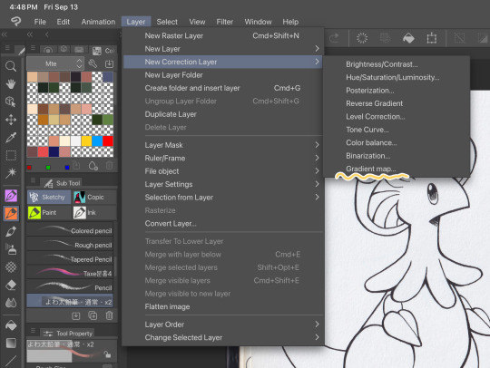
First things first, I apply a Gradient Map Layer > New Correction Layer > Gradient Map
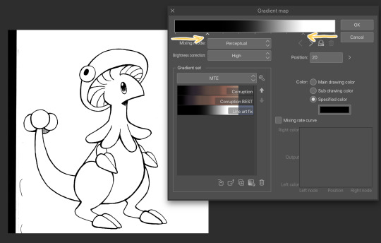
Clip has a really nice black and white map preinstalled but I made myself a custom map just by pushing the black and white a little closer, it completely clears up all the noise and makes everything really crisp! Make sure you check on your lines when adjusting things because super fine feather lines can sometimes be lost if you make the contrast too high. Extra tip! If you want to make Graphite Pencil or Ball Point Pen really nice looking as well, just add a dark grey point in the gradient map closer to the black then middle...works perfectly :^)!!
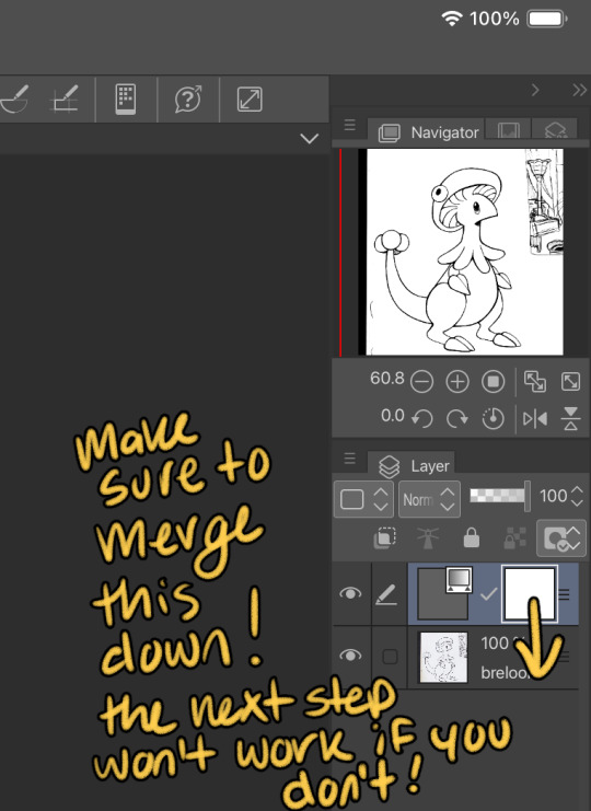
This is the point I look for stray pixels, cat hairs, ect and make sure to erase any surrounding doodles or sketches I don't want included.

GOD DAMN Those lines are CRISP-Y!!!
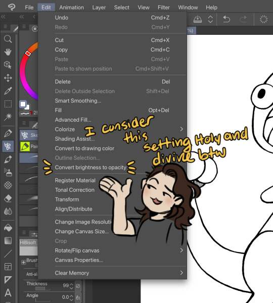
Next up we're going to want to go Edit > Convert brightness to opacity
Tbh If I didn't have this method idk what I would do with myself.... I've tried the whole "Lineart on top layer set to multiply" Method and ...ehh....
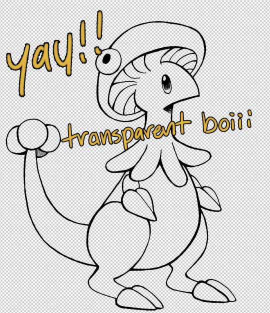
Now that I have a nice transparent line art I'll stick a new white layer down below it because the checker pattern hurts my eyes LOL
I'm going to add a read more here since this post is getting lengthy haha
I'm going to quickly go over the style I use for MTE! It has been refined to be quicker and easier to do since you know...I have a week time limit per page ... 😭 I have a completely different way I do colors for other things I want to spend more time on but I might explain that one in the future...I'm running out of steam tonight LOL

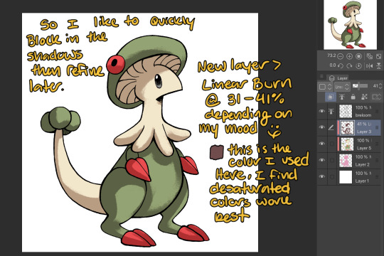
I use this really awesome brush pack that has a pencil like texture and I love it to bits...here's a link to it if your interested!
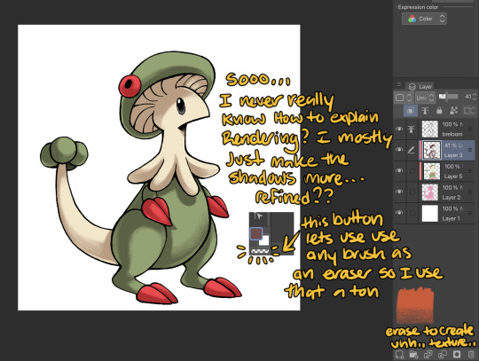
At this point I might add some overlay layers or play around with an airbrush but I think this guys done for now :^) I tend to stay away from highlights with my shading for MTE..My biggest goal is to make sure everything is clear and readable! That being said I break my own rules all the time for special panels that need the extra 'oomf!'

Slap a lazy square background and yay!! He's done!
Hope this was interesting aaaa Thank you again for the ask!!
#art#traditional art#digital art#digital colors#breloom#pokemon#ask#tutorial#art process#coloring tutorial
9 notes
·
View notes
Text

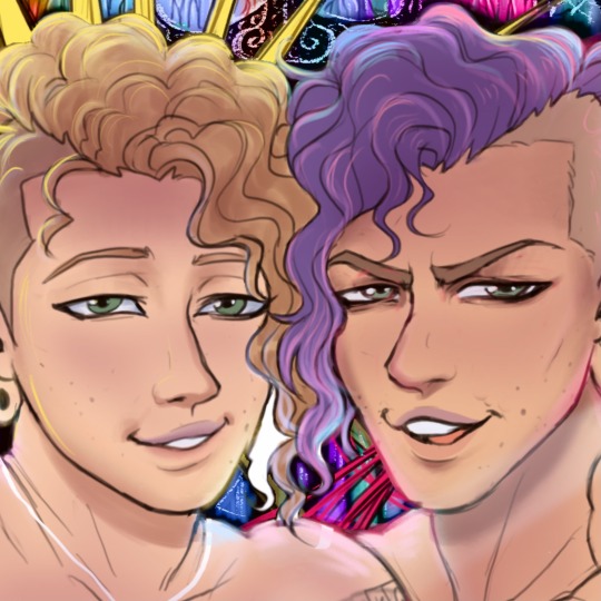
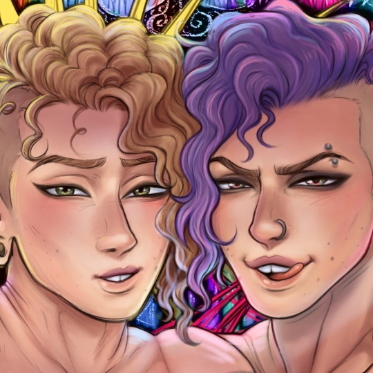
I forgot how fun coloring can be! Art by @aspenbunnz, color + additional stuff by me! IT'S ME!!! Or well, what I WANT to look like. I think this came out super awesome! I used a texture, gradient map, and a gradient for the background...plus some bonus flying hearts and sparkles X3 this was a really nice warm up! My honey also has commissions open if you want to grab some nice artwork from him, shoot them a message if you're interested!
3 notes
·
View notes
Note
All the questions you wanna anwser
(this is from an old ask game)
1. When did you start creating art?
erm idk.... 2019 or so?
2. Do you do art in any professional capacity? (Graphic design, commissions, animation, etc.)
not yet but im planning on being an art teacher
3. What are your favorite subjects to draw? (OCs, your fan faves, etc.)
anime characters..........
4. What's your least favorite part of the body to draw, if any?
hands or really any part of the body that's in perspective
5. What piece of art are you still proud of to this day? (Show or describe)


i'm not particularly proud of any of my pieces but here are some that i still really like :) (i also really like that one mari & sunny lily of the valley piece that i'm not attaching directly bc i don't wanna trigger tag)
6. Favorite and least favorite angles/perspectives to draw?
i don't really have any... what's easiest is just straight-on, but that looks boring, so I can't realistically say it's my favorite... but if it's hard then I don't like it either.... sigh
7. Who are some artists that have inspired you?
see okay the thing is. artists that inspire me seem to always have an art style that i Can't Really Replicate. like i've seen so many of those painterly-style ethereal anime girls and pieces with the most gorgeous fucking colors ive ever seen in my life and they look SO PRETTY but i just Don't Understand Them At All 😭😭
so i'd say rixypill because recently i saw one of their art pieces and the amount of relief it brought me was insane. it was a gorgeous gorgeous art piece AND it looked like something i could realistically achieve. i didn't even really realize it but for such a long time i was trying to turn my art style into Something Completely Different and idk it just made me realize that i could make beautiful art Without having it stop being My Art
8. How would you describe your art style?
pink (with guest appearances from purple, orange, yellow, and blue)
9. What's the longest you've ever suffered from artblock?
several months
10. How do you deal with art block?
i don't <3 (I do challenges with predetermined prompts, and you can add deadlines if that helps you)
11. Have you ever drawn a meme with your OCs or canon characters from a fictional media?
yeah, i think i've made mini-animatics for like 2 vines. i don't do enough art shitposting tho
12. Ever participated in a multi-artist collaboration (3 or more) such as a multi-animator project?
i mean i did like 2 meps when i didn't understand what the fuck I was doing but i don't think those can really be counted........ i've done like art telephones and 3-person art trades but nothing really outside of that
13. What kind of art do you personally not see the appeal of, and why?
i think all art has appeal if you look hard enough
14. Do you prefer to make fan content or original content?
fan content
15. Do you/have you participated in Artfight or art trades in general?
i've done artfight in the past but i don't think i'll do it again because i'm usually really busy in july and even if i'm not i really struggle with doing anything for artfight 💀 i've done a good amount of art trades tho and if any of mutuals are interested in art trading with me feel free to ask :D
16. What was something you used to struggle to draw with confidence/ease, but have now mastered?
i don't think i've mastered anything really 😭 but i'm definitely a lot better at eyeballing colors than when i first started!!
17. Your personal favorite works of art (not made by you) are...?
there are lots of really awesome works in this world that i really like and if i didn't list like 500 different artworks i wouldn't feel like i'd answered properly so im gonna sit this one out lol
18. Do you typically use filters on your art?
yeah, i use saturation filters + gradient maps + blending modes at the end of every piece
19. What's your biggest insecurity when it comes to your artwork?
i have so many 😭 i'm in the "i hate all my art" stage of improvement rn..... aside from that, i hate that a lot of my art is so boring.... like there's not a lot of interesting perspectives or actual Meaning... that's the main reason why i made ychallenge! i want to make pieces that invoke emotion & mean something to me and aren't just there to look pretty
20. What motivates/inspires you artistically? (topics, emotions, etc)
fandoms mostly! if i was doing solely originally art i'd make maybe like one thing a year
4 notes
·
View notes
Note
HELLO could you tell me PRETTY PLEASE how did you make the halftone colored effect on your latest gr63 poster? tysm!
Of course!! I love talking about my graphics!!
I learned how to create the halftone effect from a guide I cannot find right now but my steps are as follows. heads up that I work in photoshop so everything is photoshop specific I fear.
Under the cut since there is a ton of images here o7
For the halftone effect
Import image of my choice and convert it to a smart object. This guide should theoretically work without a smart object with clipping and/or layer masks but smart objects look better + they keep my workspace more organized
In the smart object I create a new layer with a solid fill of #808080, convert it for smart filters (Filter > Convert for Smart Filters) and also set it to Hard Mix in the layer blending modes menu
Open the smart filters menu for the layer (Filter > Filter Gallery) and I create two layers, first Halftone Pattern with the following settings and on top of it Torn Edges with the following settings
You can fiddle with these obviously but I have never changed these since I started using this for my halftone effect
4. Now your image probably looks like this, really wonky and bright
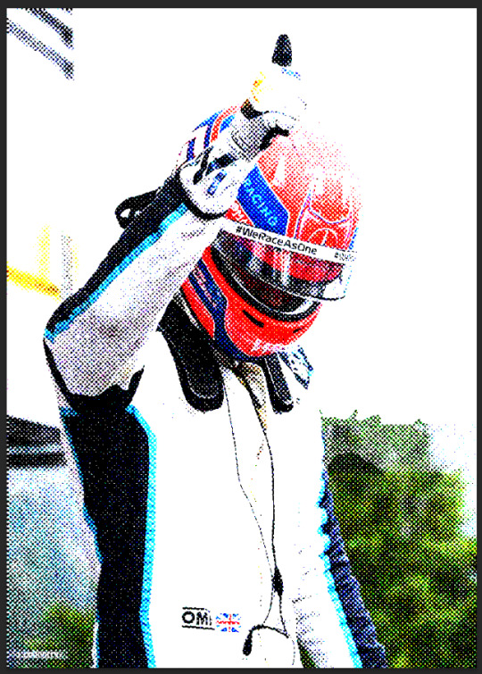
To fix it I create a new adjustment layer, usually Levels but I have used Curves before as well and fiddle with it until I like it. Dont be afraid to use multiple and just mask it! For example here Tadejs jersey is white but the background is black so to keep the texture I masked the jersey and adjusted it separately.
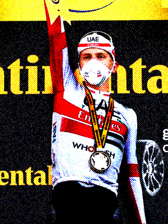
Final effect vs adjustments to keep the background texture vs adjustments to keep the jersey texture. By combining the latter two I achieved what I wanted
If I want my image in grayscale I also add a Black & White adjustment layer in between my initial image and the Levels layer, though for the effect I achieved with the George graphic we dont want that.
Gradient colors
First of all I make all my multicolored graphics using gradient maps. I am not particularly knowledgeable so my apologies but I cannot even try to begin explaining gradient maps.
So for a multi colored effect I create a gradient map once I have an image that I am satisfied with and adjust it until it looks good. Important that the color fully on your right on the gradient map is the color you want to have in the background which in my case is the beige I use everywhere.
After that I save my smart object as I would usually do (Ctrl + S) and exit to the main graphic and ideally, it should look the same in your graphic as the smart object looked.
Unfortunately I cannot help with color choices/color theory for the actual gradient map since I barely understand what is going on myself lmao. Fwiw personally I think Synth (@/jamesvowles) is awesome with colors and how they work together in his paintings so maybe he could be of any help o7
Solid colors
This is for cases like this, where all my colors are solid flat, no matter how many colors
This is where the Black & White adjustment layer mentioned comes into play. For when I do solid colors only, even with multiple like in this graphic, I create a new color layer on top of all my other layers, fill it with the color of choice, and set the blending mode to screen. no idea why screen works, someone smarter with blending modes would probably be able to explain though.
For different colors I just mask out the areas I want the color to appear in.
Final step is to combine all my layers into a folder and under that folder I create a new solid color layer with the background color of my choice, in my case beige, and set the folder blending mode to darken. Once again, I have no idea how it works but it does and that what counts to me haha, someone smarter with blending modes would be able to explain most likely.
On a final note, do experiment!! Oftentimes I like getting to the point of where I would have usually used a gradient map (so no B&W layer) and then see what I can do with blending modes! Thats how I ended up with this image of Primož, its just a yellow color fill layer set to Hue blending mode
Hopefully everything makes sense, feel free to ask more if you are confused or want to know more about any part of my graphics <3
#ask#anonymous#eric.graphics#thank you for asking about my graphics I love talking about them!! do ask more if you want to i get stupidly excited about this
8 notes
·
View notes
Text
my drawing process (thank you @pepper-ika!)
i draw and colour for a long long time. i don't do the traditional sketch + lineart + colour -- sketches are hard to line, they're kind of time-consuming and usually they end up better than the lineart, so i just draw like normal and clean it up before colouring. i start at the head and end at around the feet, kinda like a person showering (lol). here i'm using your typical pencil brush you can find in any standard art program.

a tip i got from another artist was to colour using a thick, opaque pen brush that varies a lot in width. it saves a Lot of time. before they showed me that, i made the mistake of using a soft, painterly brush to colour my art. it hurt my wrist because i had to press really hard to get flat colour -- when all that time i could have just been using a pen brush! also, i start with soft colours because they're nicer to look at.

2. i do colourful midtones like redness in the skin or maybe a blue five o clock shadow if they have one. from this point onward, i use a flat square-ish brush combined with a painterly smudger and a soft airbrush.
i read somewhere that you should apply perfume on the moistest parts of your body so i kind of use that same idea when drawing redness. usually i do it where skin meets skin: folded arms, a crunched back, closed hands, and that place where the thighs touch the buttcheeks, lolol. and of course: the nose, lips, and ears. it makes the skin look real and warm and lively!

3. i lay down my shadows and lights, usually in that order. and at this point, i'm throwing extra shadow on wrinkles, fat, bumps, lumps, etc. a body without rolls is like an angel without wings!
also i smudge like CRAZY here. just like how it's impossible to have "too much gravy" on your chicken, it's impossible to have "too much blending" when you're drawing skin. blend that ish.
when it comes to the colour of the shadows, i always make shadows the base colour but darker and more saturated, and i move the hue a little to the left (for example: orange goes to red, green goes to yellow, purple goes to blue). i do that with, like, every colour. i can't tell if it's lazy or not but at this point i'm too scared to ask.

4. finally i make some minor adjustments like liquifying to fix lopsided eyes or oversized heads/hands. when i was in high school, my art teacher would say "great, but watch the size of the feet, hands, and neck," lolol. he was right ofc. when i go "hm... that looks a little weird," i have to trust that gut feeling because when i do fix it, it ends up looking way better. here is a horrifying gif illustrating that.

AHH!!!
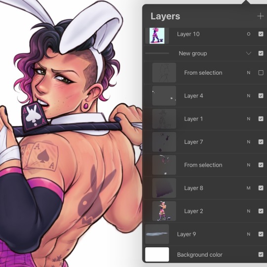
alternatively you could do a messy line and color, then do a whole paintover like i did here. this is awesome for details because you dont have to go back and change the lineart - you just paint over and add whatever you want and redraw the line to fit it.
i dont really use the different layer modes that much. in this one i used a gradient map of the drawing as an overlay. idk if that really does anything major but it does create a new range of colors to play with. i also used a multiply layer to cast a big shadow over the card (layer 8) because it has this tiiiny little pattern that would be a pain in the butt to draw shadows over. everything else is pretty standard.
(and no i dont name my layers... yes i will be changing my name and moving countries)
another thing worth noting: i use airbrushing A LOT. i remember reading somewhere that using airbrushes is like. a cardinal sin. it’s not, man. it’s great. airbrushes and smudging are dope and i use them all the time.

i hope you found this helpful! have a great weekend <3
34 notes
·
View notes
Text

The Rainbow Serpent's Herald
Grayscale version (x)
Kenyizsu's First Law: Everything that receives my undivided attention shall be redesigned into a fantasy setting sooner or later.
---
It is rare the Rainbow Serpent crosses the veil to the mortal realm from the Dreamtime, even rarer for her to choose a champion among penguins. Once chosen, the champion must face all manners of supernatural foes and challenges to keep the Dreamtime eternal, the worlds in balance and their fellow penguins safe. Given the Dreamtime's timeless nature, peeking into the past, other parts of the present, or into the future, or even temporary time-traveling can indeed happen, usually in the most inopportune moments possible. Whether or not the champion experiences this sudden shift in life duties as a blessing or a curse, is entirely up to the penguin himself.
Personally, Rory absolutely loves the ride!
---
So! Once again a fantasy redesign! Because why not? :D I have literally zero plans with this idea beyond this picture, but by all that is holy, I researched the heck out of it as much as I could.
This is also the first picture I have colored with the Gradient Map technique, and a bit of a paintover as the final touch. Please let me know how it turned out, the good and the bad! Thank you! :blowkiss:
Trivia
Rory is from Bells Beach, Australia, which used to belong to the Wathaurong nation, as I have found out. In their art they don't really use dots, mostly crosshatching and circles, hence I opted to leave out dot-like decoration off the weapons entirely (Rory's design has them already, I'm not changing that).
The beaked boomerang (looking like a big 7) was one type of non-returning boomerang mostly used for melee fighting, acting as a hooked weapon. They also used it for cutting meat and digging, and should the beak break off, they just chiselled it down and used it as a regular non-returning boomerang. Originally Rory had a spear, but once I found this type of boomerang, I knew this would be his main weapon, certainly. The spear still made it onto the picture because I found a hella awesome looking aboriginal spear in a museum on Google! :D
The Rainbow Serpent's head shape and darker coloring compared to the rest of her body is based on the inland taipan. The design would have been either that, or the largest snake in Australia, the scrub python. But given how the inland taipan has the most potent venom in the entire goddamn world (cuz it's Australia, babyyy!), the choice became obvious. Her frills on her head come from some interpretations of the Serpent where it is drawn with horns or some kind of feathers (?) growing out of the two sides of his head, behind the eyes.
I haven't actually found any Rainbow Serpent-related myths within the Wathaurong or the Kulin alliance circles, they mostly believed in a creator spirit called Bundjil in the form of a wedge-tailed eagle. I guess the Serpent wasn't worshiped around those parts of Australia. Still, the general composition of Rory standing with a Rainbow Serpent was very strong in my mind, so I did not let that one go.
Originally the Serpent would have been absolutely massive, but I struggled to come up with a composition that would feel right to me. I probably could have done so eventually, but by pulling away from that and making it a more personal composition helped me progress finally. Maybe one day I will do the other idea!
I love my hobbies, honestly. I learn about so many awesome things. Hope you guys like the picture, let me know! ^^ Take care!
2023.08.29.
15 notes
·
View notes
Text


Watched a couple of awesome photoshop tutorials, grabbed some screenshots from public domain flicks, and went to town!
Skull from: The Screaming Skull (1958)
Bela Lugosi from: White Zombie (1932)
Castle Backdrop also from: White Zombie (1932)
Photoshop Tutorials Used:
Photoshop Tutorial: Airbrushed Film Poster Style Photo Effect
Photoshop Game-Changer! GRAIN SHADED GRADIENT MAPS
0 notes
Note
since it’s been about a year and i’ve learned many new things, i wanted to reblog this with some more art tips :D (also more digital art centered ones!)
try to use the erase button over the undo button more. i really do think that it helps to not be constantly undoing every line you make and be able to make more adjustments and not be so perfectionist (been doing this a lot since making going to the eraser one of my actions on my apple pencil)
definitely explore programs/materials your using- i managed to get a graphics tablet for free and i’ve used it to mess around (and struggle) with different programs like krita and csp. and anyways, who knew it was so nice to draw with crayola markers??
learn your layer modes - my person favorites are overlay, add, and multiply, but there’s a lot for a reason! messing around with them can lead to cool things! (this goes for other features you may not use in your program!)
if your coloring - EDIT your colors!! you might not realize how desaturated you’re making things, or maybe how they aren’t totally working together. i recommend duplicating your color layer(s) and messing around with curves, saturation, and gradient maps (these are procreate features i do not know what exists on other programs-)and then using layer modes + opacity to make everything nicer. also - if you want to just tone everything one color (or just make everything warmer or cooler) - fill a new layer thats above either the colors or everything and set it to the layer mode “color” and adjust opacity :)
the liquify tool - im not sure if this is just a procreate thing or not but its so awesome to use when editing proportions. i like to flip my canvas and select all my layers and push things around and make things bigger and smaller. it can be a lot more efficient than redrawing things :)
dont use like a billion brushes - sometimes less is more, i use about 3-4 for every drawing. id recommend using a textured brush among some less textured brushes to so its not overwhelming or underwhelming with so few brushes.
draw traditionally!!! - drawing traditionally will do things like give constraints and force things like line confidence and problem solving (especially if you are using (semi) permanent materials!!!). it doesn’t have to be anything particularly fancy, it can just be little sketches and practice, or just messing around with materials.
and again - have fun!!! art is a fun thing that you should be enjoying. none of these tips matter if they aren’t making you happy/enjoying the process of creating! just make things, cause thats really cool, the technical stuff only matters if you want it to matter :)
btw if you have anything specific you want me to talk about, ask! i love talking about art and giving art tips!
Have any art tips, your art is cool and I've been trying to get into digital art recently.
thanks :)
something ive learned recently: set ur layer to add on digital art for lighting - best things ever
but if you're just starting out with digital art, find a program ur comfortable with (i recommend procreate), and just play around and figure out what brushes and stuff you like, find digital artists on youtube for more specific tips (i recommend LavenderTowne for more cartoon-ish style digital art, but some of her tips can be good for any style)
if you've been doing traditional for a while, it'll just kinda throw you off to start digitally drawing, but eventually you figure it out and get the hang of it and to have pretty much every tool and color at your disposal is cool, just gotta learn how to use them :)
but if you're new to art entirely, just draw and have a good time, like thats my biggest tip, explore your style while also having fun, dont worry if it's not the next mona lisa, that's not important, it's gonna take time, and there will never be a point where you will have the skills to draw every single thing you want exactly how you want it, its just impossible. also you can look at other peoples art also take inspiration to start creating your style, i swear though i feel that step by step tutorials can hurt your art SO BAD, unless they give a thorough explanation into why you are doing what you're doing, you haven't learned anything, and when you try to do it again, but in different contexts, it's gonna look weird, because you don't actually know what you're doing.
ALSO JUST GENERAL TIP JUST WATCHING PEOPLE DRAW, IT DOESNT EVEN HAVE TO BE A TUTORIAL OR ANYTHING, ITS JUST SO HELPFUL TO WATCH SOMEONE'S PROCESS
heh i don't know if this helps, i can totally give more specific tips if anyone asks ^^
4 notes
·
View notes
Text
art school, art lesson
art teacher: wow you drew this skeletal hand so quick and good without help, so unusual for you
me:

#i straight up just sat there having flashbacks to everything i experienced in this fandom#i have rocky relationship with undertale especially au fandom#whether you believe me or not i started drawing humans only in 2018-2019#in my 6 years of drawing experience 3 i drew really bad looking skeletons#i think you can see where the cheek thing started#mention of undertale au#the reason why i have rocky relationship with undertale au fandom is really simple#i was into gay selfcest skeleton fanfiction.#i traumatized myself beyond ever healing#fun fact i actually discovered the existence of omegaverse(my fav genre) there#you can judge my taste all you want i know things i like are great#but yeah i didnt know i was actually good at drawing skeleton hands#shitpost#my art#digital art#doodle#i discovered gradient maps in firealpaca where i draw sometimes and its awesome#that is how i actually look yes#i dont wear pretty clothes im dressed for funeral 24/7 and even look like zombie since early teen age#despite that i also wear yellow clown boots and smiley star earrings
10 notes
·
View notes
Text

From: Today!! <3
Time Spent: ~1 hour 20(?) minutes
THIS is the piece I got excited enough about sharing to finally post the others FBDHFJB
Inspired by the scene where Airi strangled Hina, and Hina just said "I... lo.. you.." I LOVE That scene and I LOVE Hina !!!!
Other inspiration includes an ask sent to wombrion about how they draw with shapes first rather than lines (which is how I drew this!!!) And a few songs from Will Wood and the Tapeworms' album, Everything is a Lot (the songs remind me of Hina sooo much, hehe)

This drawing was originally intended to be just layout for a short animation, since I haven't done that in a while, but I realllly wasn't feeling it, so I did the aforementioned drawing-with-shapes-first style, and had a lot of fun !!!!
Since it's in greyscale, I ALSO played around with some gradient maps! Ended up looking like this


which is PRETTY AWESOME!!!
Another fun detail is that you can see Hina's head is turned a little bit, and the hair on the side she turned away from is more straight/stretched out than the other side. teehee. Her shoulders aren't straight either!! :D
#kitanai kimi ga ichiban kawaii#kitakawa#hinako hanamura#id in alt#not tagging airi here. her hands are NOT enough of a cameo#FBDHJSBF#my art
13 notes
·
View notes